Every 2026 Color of the Year We Know So Far and How to Style Them
This site contains affiliate links to products. We may receive commission for purchases made through these links. Price at time of publish date may change.
Believe it or not, many companies have already released their picks for Color of the Year 2026. And honestly, we’d be lying if we said we weren’t eager to see what’s in store! Where Colors of the Year for 2025 were a mix of bold and brave (like Behr’s 2025 Color of the Year, Rumors, for example), many of this year’s hues lean more organic, with muddy greens, terracottas, and walnuts taking center stage. We’ve been doing our research and talking to our friends at our favorite paint studios and creative companies, and we’re outlining all of the 2026 colors of the year to look forward to, how to style them in your home, and the secrets behind the color choices.
It looks like earth tones will take the upcoming year by storm, with most leaders of the home design and interiors world pointing their Color of the Year for 2026 to rich, muddy, organic hues. Take Hidden Gem by Behr and Warm Eucalyptus by Valspar, for example. Though these shades of green differ, they have a similar tonality—where the darkness of Hidden Gem offers a grounded contrast, Warm Eucalyptus feels light and comforting. Both, however, have a subtle, muted quality to them that feels organic in nature. We see this come up in a variety of hues for 2026, too—and we’re ready to lean in. And if you love all things color, make sure to keep tabs on our Drew & Jonathan Color of the Month, too!
Silhouette by Benjamin Moore
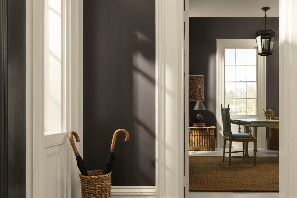
For their 2026 Color of the Year, Benjamin Moore has decided on Silhouette AF-655. “The connection between fashion and interiors has always been a source of inspiration but this year in particular, we’ve noticed a renewed interest in suiting and classic silhouettes; the resurgence of timeless pieces; and the growing interest in the brown color family,” said Andrea Magno, director, color marketing & design at Benjamin Moore. “Silhouette embodies these qualities with its depth and luxurious blend of burnt umber and delicate charcoal undertones. Like a perfectly tailored suit, this hue has the versatility and softness to bring a space from expected to exceptional.”
Divine Damson by Graham & Brown
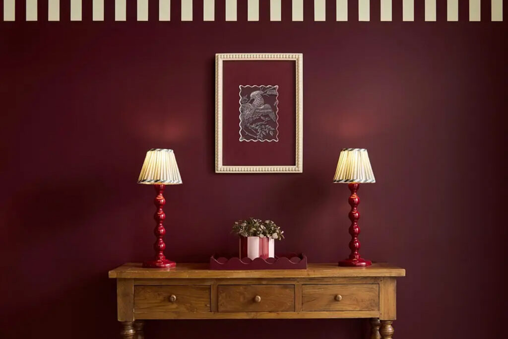
Divine Damson is a nutty, chocolate-plum color that can transform a room into a show-stopping design. According to the Graham & Brown site: “A perfect deep damson shade, the Color of the Year 2026 is a timeless and versatile color that suits a variety of styles and environments. The dark damson color evokes a sense of elegance, luxury and sophistication.” Alongside their Color of the Year, explore their Design of the Year (Eternal Weave, a whimsical print that mixes natural and mystical designs) and Mural of the Year (Eternal City, inspired by the Pink City of Jaipur) on their site, too.
Coffee Bean by Krylon
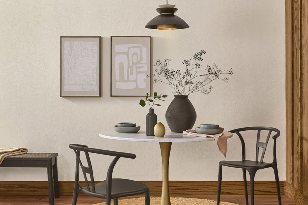
Grounded and muddy, Coffee Bean is the perfect addition to the home that aims to create a warm atmosphere. “With its rich, earthy depth, Krylon 2026 Color of the Year, Coffee Bean, lays a harmonious foundation for projects that echo the beauty of nature,” said Lisbeth Parada, Color Marketing Manager at Krylon. Use the spray paint for a DIY project, or incorporate the versatile color in small touches throughout the home and yard.
Midnight Garden by Dunn-Edwards
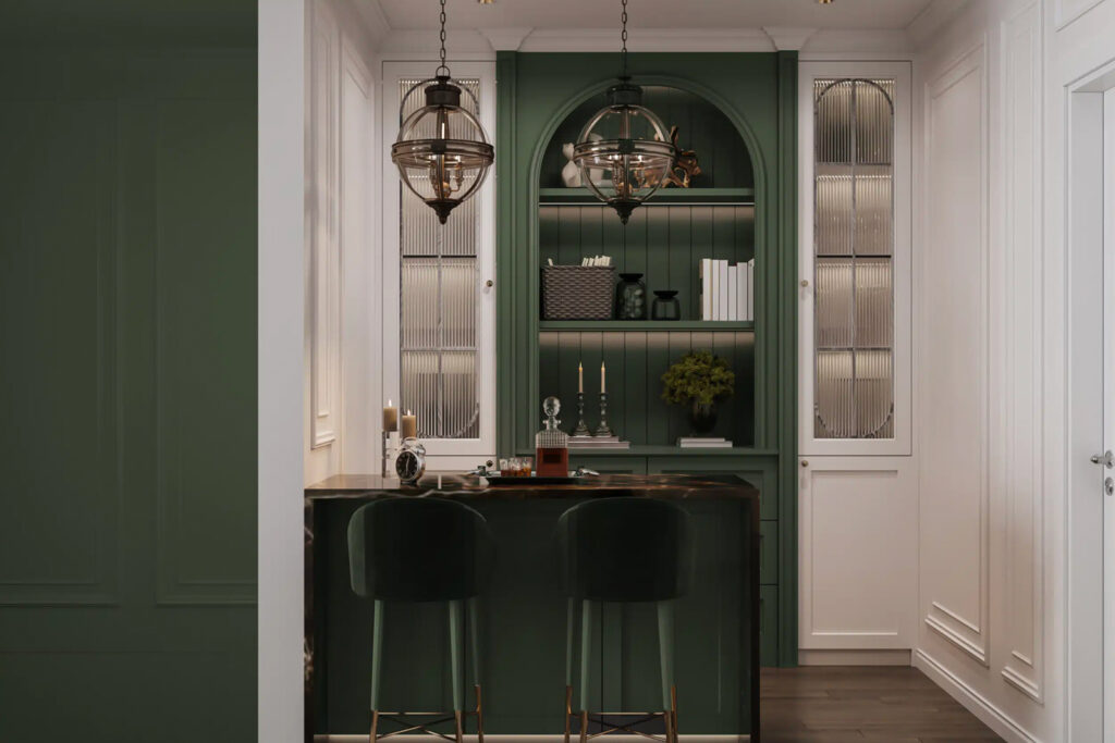
Dunn-Edwards has chosen a muted green hue as their marker for 2026: Midnight Garden. It’s a serene neutral that can blend easily into many spaces and styles. “Midnight Garden is the green that works everywhere—from cabinetry and walls to accents and exteriors,” said Lauren Hoferkamp, Color Marketing Manager at Dunn-Edwards. “Its versatility makes it equally at home on interiors and exteriors, pairing effortlessly with natural textures, warm neutrals, or sleek minimalism.”
Universal Khaki by Sherwin-Williams
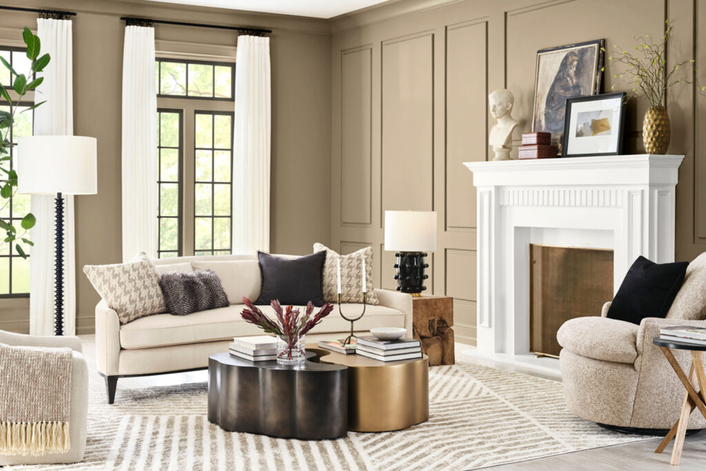
Universal Khaki is refined, approachable luxury inside one dynamic hue. It’s sophistication without pretentiousness; warmth without staleness; and versatility without boredom. “Khaki is more than just a neutral—it’s a timeless, go-anywhere shade that brings a sense of grounded elegance to any space,” shares Sue Wadden, Director of Color Marketing at Sherwin-Williams. “With its warm, earthy undertones, Universal Khaki SW 6150 effortlessly complements a wide range of colors, creating a rich, inviting backdrop that can transform an entire design with quiet confidence.”
Hidden Gem by Behr
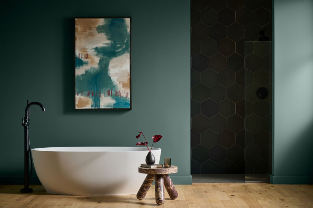
Bold yet familiar, Hidden Gem is a special mix of jewel and earth tones. What’s created is a calming, elegant green that can instantly transform any room into a den of inspiration. “Now more than ever, there’s a growing appetite for colors that challenge convention and bring an unexpected sense of wonder to everyday spaces,” says Erika Woelfel, VP of Color and Creative Services at Behr Paint. “Hidden Gem captures that spirit in both name and color—its depth and refinement meets the desire for colors that are eternally stunning and stylish.”
Special Walnut by Minwax
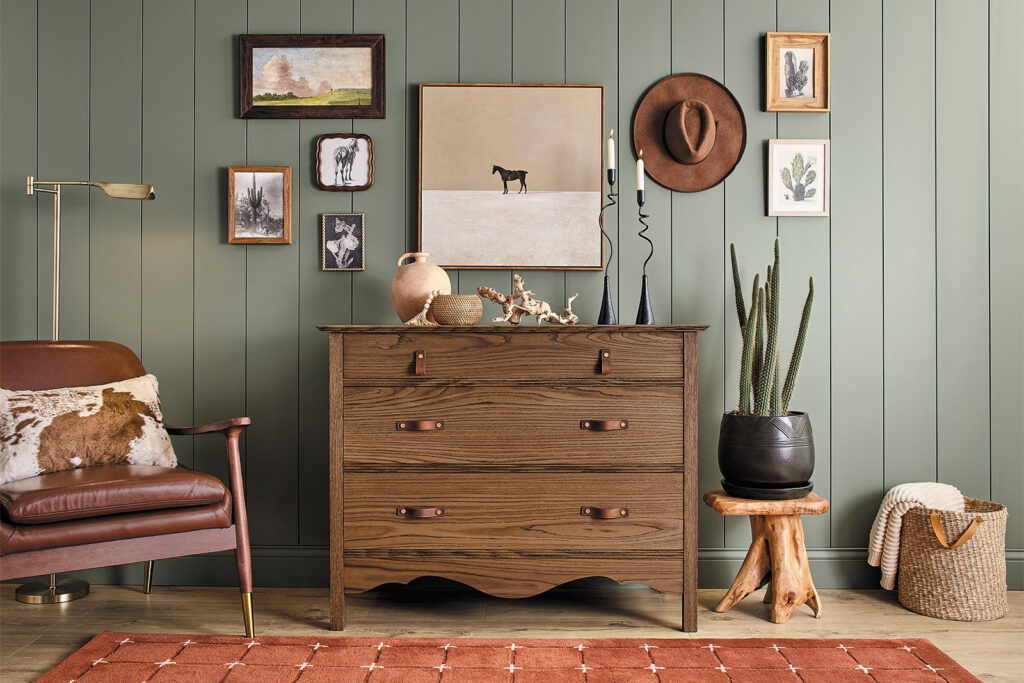
If you’re looking for a stain to pair well with just about any of your decor no matter your style or taste, you can’t go wrong with Special Walnut. “With wood emerging as a key element in interior design—from furniture and flooring to cabinetry and architectural details—there’s a renewed appreciation for finishes that enhance its natural character,” says Lisbeth Parada, Color and Design Lead at Minwax. “Special Walnut delivers with a classic, dimensional tone that feels both familiar and fresh. Its versatility makes it a favorite across styles and applications—whether you’re restoring a vintage piece or finishing a weekend project.”
Melodious Ivory by Dutch Boy Paints
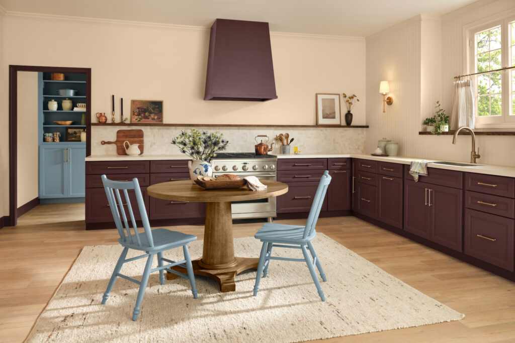
“Our 2026 Color of the Year invites homeowners to embrace what matters most—comfort, quality and connection,” says Lisbeth Parada, Color Marketing Manager at Dutch Boy Paints. “Melodious Ivory offers a classic backdrop that beautifully supports the textures, elements and personal touches that make a space truly feel like home.” And what’s great about it, too, is how well it complements other colors and patterns. Its warmth will provide that cozy feel no matter what, and its neutrality acts as the perfect companion to any bold design.
Warm Eucalyptus by Valspar
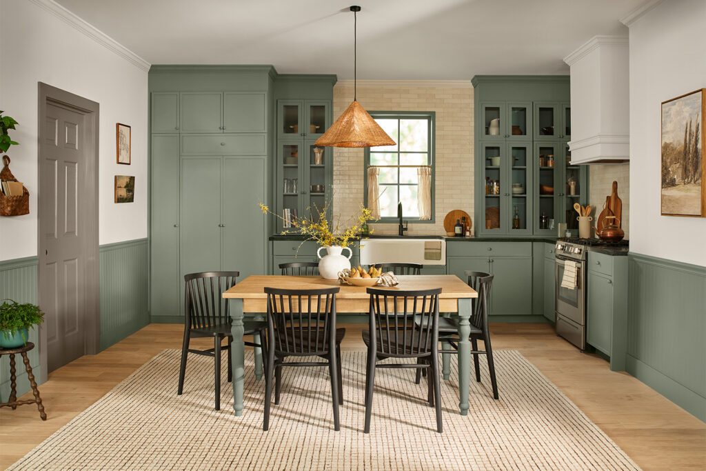
“Warm Eucalyptus is more than just a beautiful shade of green, it’s a reflection of the comfort we crave in our homes,” says Sue Kim, Director of Color Marketing at Valspar. “Its warm undertones create a grounded, welcoming mood while drawing inspiration from nature and the familiarity of retro design. This is a color that encourages restoration and resilience.” This shade could look beautiful just about anywhere when utilized right. Pair with complementary shades of rich brown, amber, or dark walnut for a vintage-inspired look that still feels fresh.
Warm Mahogany by Glidden
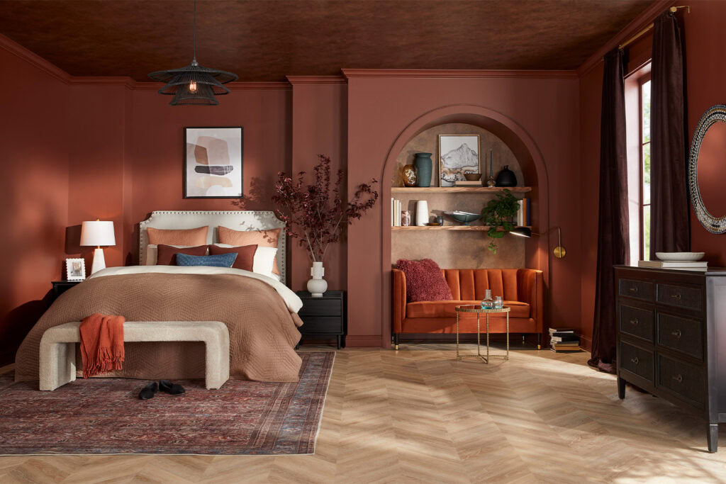
Glidden calls Warm Mahogany “a rich, grounded red that has a classic vibe, but feels brand new when used in big doses or sleek designs.” This shade would be perfect for color drenching, as we can see here in the photo above. It’s striking, yet organic, so it’ll never feel too harsh. “DIYers are faced with selecting a color that fits within the larger lifestyle of a space, not just one prescribed function or moment in time,” says Ashley McCollum, Glidden Paint Color Expert. “We’re torn between colors that feel authentic, personal, and safe, and those that give a rush of newness, risk, and excitement. Converging style and history, Warm Mahogany is a perfect match with the Glidden brand’s 150-year heritage—bold enough to draw immediate attention and reserved enough to make a timeless statement. This color truly outlasts the moment and owns the mood!” McCollum adds.
How to Achieve the Chic Western Decor Style at Home
An expert shares her tips for how to get started.
Read More